Are you ready for the trip?
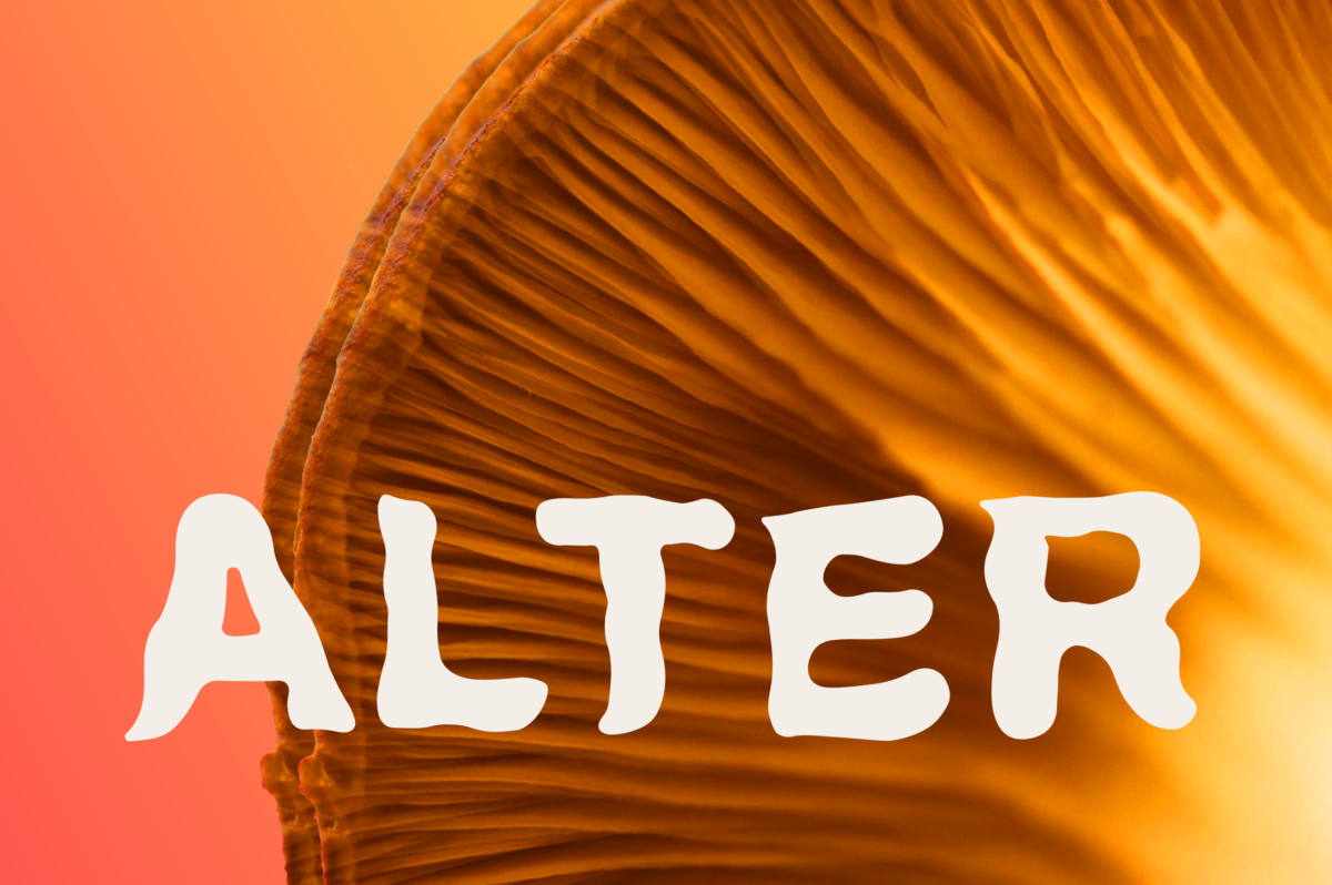
I am pleased to present to you ALTER – an artistic journal exploring the human cognitive experiences when undertaking certain lifestyle practices/activities and/or consuming natural substances.
Created as a part of the Editorial Layout module at KEA – Københavns Erhvervsakademi, the first issue of ALTER looks into topics such as Eye Gazing, Stroboscopic Lights and Psilocybin Mushrooms.
In a team of eleven, I took up the role of Chief Creative Director, operating as a ‘bridge’ between the Editorial team and the Writing & Photography department. Working closely with both groups, my day-to-day activities were scheduling regular meetings, overseeing deadlines, conducting various research important for the dynamic and smooth progress as well as deciding on genre, image style and typography.
FRAMES OF MIND AND FIRST IDEAS
Kicking off the project with mood boards alongside the creative brief, our Editorial team firstly had to decide on how to approach the visual side of the magazine. Considering the three different topics, we needed to figure out how to make each chapter unique, yet create a compact content that would work well together.
Our mission was to bring real-life emotions to the reader by capturing these unusual experiences on paper. To achieve these results, we laid our main focus on the visual side of the magazine rather than the written content. Nevertheless, we presented each topic in a very detailed way after conducting thorough research and also practising some of these activities, such as eye gazing, by ourselves.


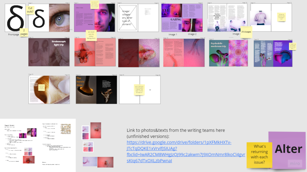
FLAT PLAN AND DECISION MAKING
Throughout the whole process, we have created various flat plans that established the magazine’s foundation and the overall layout. With each version, our concept looked more detailed and realistic.
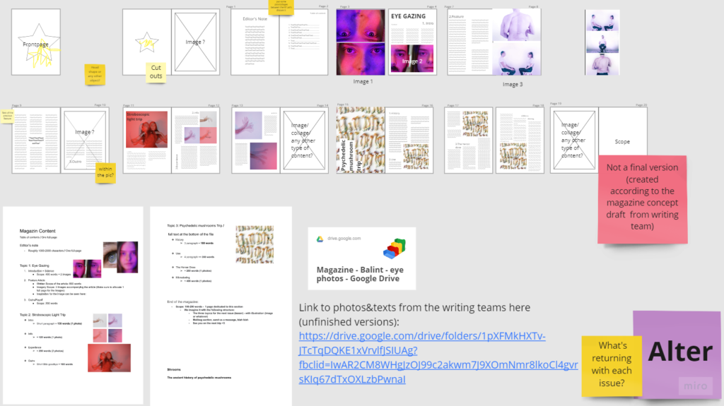
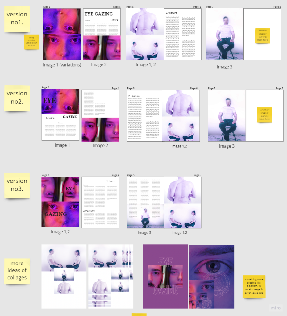
In the very last flat plan, we already included the final images from the Photography team which helped us to understand the volume of the magazine and build the ‘ideal’ layout. According to that, we finalised the structure, chapter order and started making the magazine coherent.
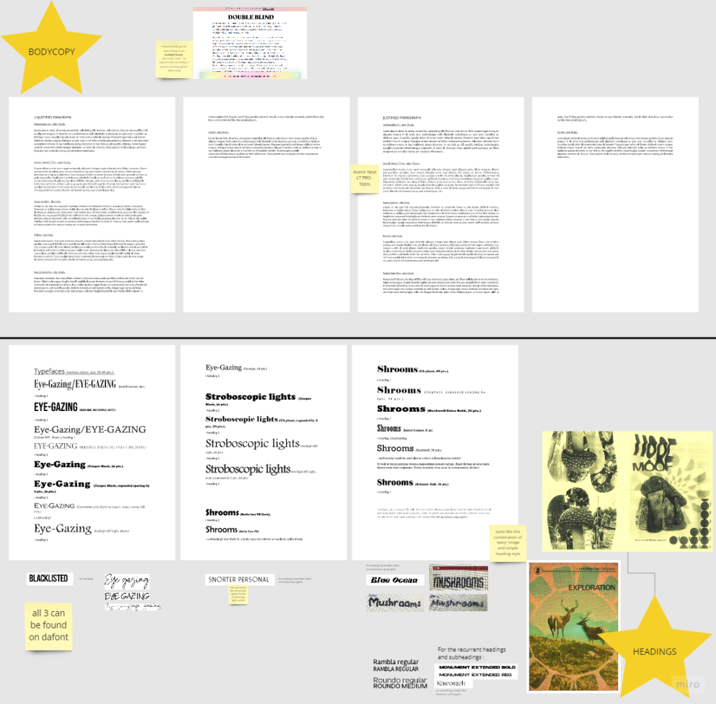
TYPOGRAPHY CHOICES
As Creative Art Director, one of my duties was deciding on the typography that would fit the magazine’s look, working with the visuals as well. As ALTER was a visual magazine, we did not want to get the reader overwhelmed by the text.
For the bodycopy, we have decided on using Avenir Next LT PRO in 10-point size as we liked its simple, slightly rounded style. This style works with the images very well together as it does not empower the magazine, yet it contributes to its simplicity.
In terms of main headers, we decided on using various styles that would fit into each chapter, reflecting the themes and serving their purpose. For the subheading, though, we used Monument Extended style (both regular and bold) – the recurrent text style works as a symbolic element repeating with each issue.
THE OVERVIEW
When looking back at these five busy weeks, I had so much fun working with my team on ALTER as I have gained many valuable skills in terms of layout and graphic design, become more confident in the decision making and also connected more deeply with my teammates as well. Personally, I enjoyed every bit of the process, including the time pressure and all the stress behind it – after all, I believe these are the experiences that shape the person we are today.
Enjoy!